GoodRx | Senior Product Designer
Point-of-Sale Rewards Redemption
Creating one rewards system that adapts to fourteen member states.
The challenge
The same system needed to answer a different question for every user.
Rewards redemption already existed in the GoodRx app, but bringing it to the web meant designing for Free and Gold members at very different stages of earning and redemption.
At the same time, we wanted to encourage members to use their points for prescription savings rather than gift cards, without removing that choice.
My approach
Before designing the experience, define what each member needs from it.
One experience had to make sense across every possible member state. Rewards could vary widely based on a user’s membership type, coupon claim status, challenges completed, points balance, and existing discounts.
I worked through fourteen iterations to define what information, actions, and redemption options should appear in each state. This gave the experience a consistent structure while allowing it to respond to where each member was in their rewards journey.
| State | Member type |
Coupon used |
Challenges completed |
Points balance |
Existing discount |
Savings redemption |
Gift card redemption |
|---|---|---|---|---|---|---|---|
| 1 | Free | No | No | Under 3,000 | No | Disabled | Disabled |
| 2 | Free | Yes | No | Under 3,000 | No | Enabled | Disabled |
| 3 | Free | Yes | Yes | 0 | No | Disabled | Disabled |
| 4 | Free | Yes | Yes | Under 3,000 | No | Enabled | Disabled |
| 5 | Free | Yes | Yes | 0 | Yes | Disabled | Disabled |
| 6 | Free | Yes | Yes | Under 3,000 | Yes | Enabled | Disabled |
| 7 | Free | Yes | Yes | 3,000+ | No | Enabled | Enabled |
| 8 | Free | Yes | Yes | 3,000+ | Yes | Enabled | Enabled |
| 9 | Gold | Yes | Yes | 0 | No | Disabled | Disabled |
| 10 | Gold | Yes | Yes | 0 | Yes | Disabled | Disabled |
| 11 | Gold | Yes | Yes | Under 3,000 | No | Enabled | Disabled |
| 12 | Gold | Yes | Yes | Under 3,000 | Yes | Enabled | Disabled |
| 13 | Gold | Yes | Yes | 3,000+ | No | Enabled | Enabled |
| 14 | Gold | Yes | Yes | 3,000+ | Yes | Enabled | Enabled |
After examining each state individually, I grouped the fourteen states into three behavioral groups based on the redemption paths available to users. This reframed the individual states around what users could actually do, shifting my focus from the underlying system logic to the user experience.
| State | Member type |
Coupon used |
Challenges completed |
Points balance |
Existing discount |
Savings redemption |
Gift card redemption |
|---|---|---|---|---|---|---|---|
| Not eligible to redeem No redemption paths | |||||||
| 1 | Free | No | No | Under 3,000 | No | Disabled | Disabled |
| 3 | Free | Yes | Yes | 0 | No | Disabled | Disabled |
| 5 | Free | Yes | Yes | 0 | Yes | Disabled | Disabled |
| 9 | Gold | Yes | Yes | 0 | No | Disabled | Disabled |
| 10 | Gold | Yes | Yes | 0 | Yes | Disabled | Disabled |
| Savings only One redemption path | |||||||
| 2 | Free | Yes | No | Under 3,000 | No | Enabled | Disabled |
| 4 | Free | Yes | Yes | Under 3,000 | No | Enabled | Disabled |
| 6 | Free | Yes | Yes | Under 3,000 | Yes | Enabled | Disabled |
| 11 | Gold | Yes | Yes | Under 3,000 | No | Enabled | Disabled |
| 12 | Gold | Yes | Yes | Under 3,000 | Yes | Enabled | Disabled |
| Choice of rewards Two redemption paths | |||||||
| 7 | Free | Yes | Yes | 3,000+ | No | Enabled | Enabled |
| 8 | Free | Yes | Yes | 3,000+ | Yes | Enabled | Enabled |
| 13 | Gold | Yes | Yes | 3,000+ | No | Enabled | Enabled |
| 14 | Gold | Yes | Yes | 3,000+ | Yes | Enabled | Enabled |
This grouping also helped define which redemption options the UI should present in each state. Users with no available paths needed clear feedback about their eligibility, those with one path needed a focused experience around their available option, and those with two paths needed access to both savings and gift card redemption. This gave me a concrete framework for mapping each state to the right UI behavior and avoiding confusing or unavailable actions.
Grouping states by member behavior
The interface needed to respond to more than a points balance. Eligibility, coupon usage, and existing rewards determined which actions members could take and what guidance they needed.
I mapped the individual states and grouped them by the behavior they represented: redemption unavailable, savings redemption available, or a choice of rewards. This made it easier to identify which UI elements needed to change across states and which could remain consistent.
Designing the UI for each state
I designed the modules for each state, using existing design system components in new ways and combinations to communicate eligibility, reinforce the preferred action, and provide clear feedback to the user.
Callout badges explained why a redemption action was blocked.
Message bars confirmed when a prescription discount was available.
Primary buttons emphasized savings redemption, the preferred action, and were enabled or disabled based on eligibility.
Secondary buttons offered gift card redemption, a less-preferred alternative action, and were likewise enabled or disabled based on eligibility.
While these components already existed in the GoodRx design system, I applied them to these new usage scenarios and added contextual cues, such as a lock for blocked actions and a checkmark for available discounts, to create a consistent visual language across states.
Possible UI state combinations for the savings module.
Possible UI state combinations for the gift card module.
Possible points value module.
One area where I had a different perspective was the module heading. I felt “Redeem your points” was too action-oriented for a module that also displays the user's points balance, their prescription savings value, and redemption options that may not yet be available. I raised this concern, but ultimately aligned with the Senior Content Designer's recommendation to start all headers in this section with a verb.
In retrospect, I feel even more strongly that a broader heading, such as “Your rewards,” while repetitive with the page name above, would better reflect the module's full scope and remain accurate across all user states, including when redemption is locked. It's a small copy decision, but one that illustrates how I think about the relationship between content, interface hierarchy, and the underlying product logic.
Prioritizing prescription savings.
The two ways to spend points weren't equally important.
Members could use eligible rewards toward prescription savings or redeem them for gift cards, but the product strategy prioritized helping members save on prescriptions.
I separated prescription savings from the existing gift card flow and gave it greater visual prominence, having it also be the first primary action visible on mobile. This made the preferred path easier to understand and access without hiding the alternative.
#1
Free member
Under 3,000 points
No discounts
#3
Free member
0 points
No discounts
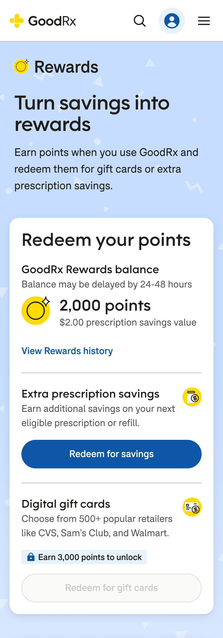
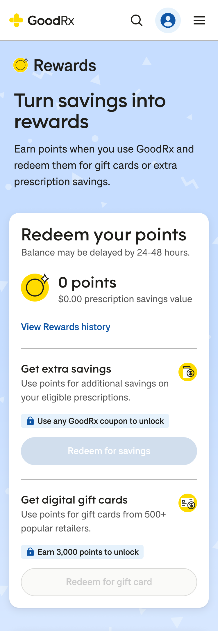
#5
Free member
0 points
Discount ready
#6
Free member
Under 3,000 points
Discount ready
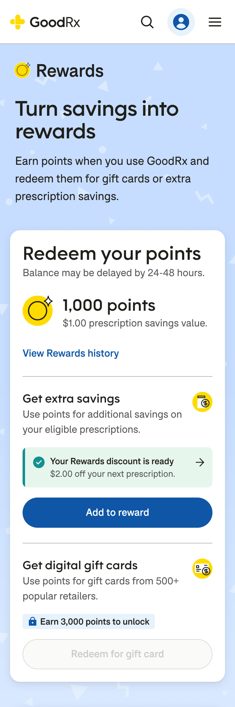
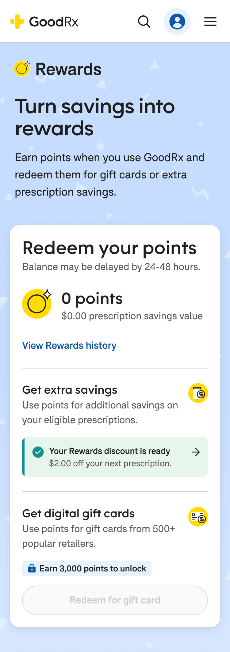
#7
Free member
3,000+ points
No discounts
#9
Gold member
0 points
No discounts
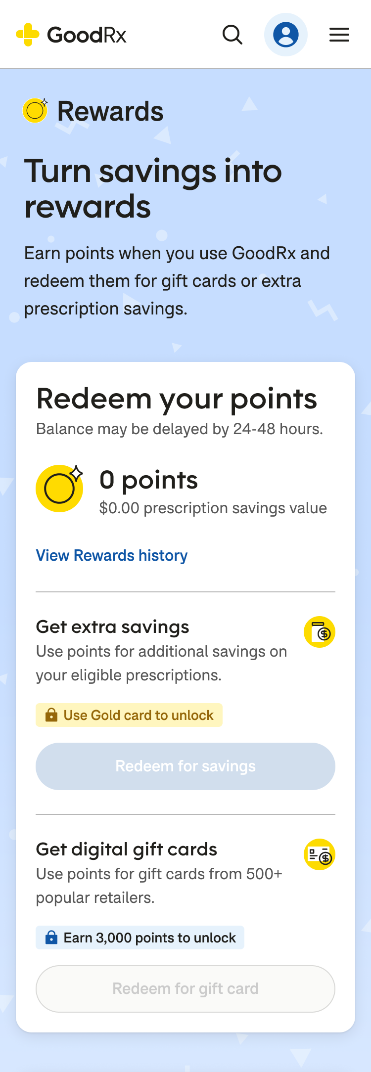
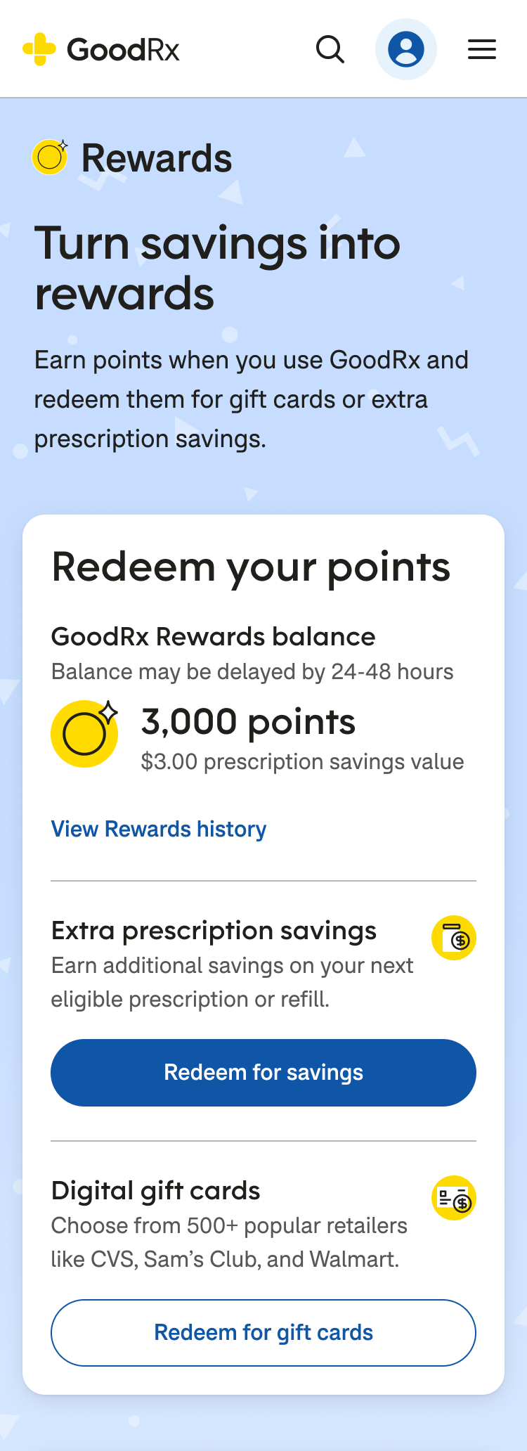
Example state combinations on mobile, labeled according to the previous table.
Designing for progression, not just individual states.
The rewards module needed to reflect where members were in their journey, not just display a static points balance. As eligibility and rewards changed, the interface needed to update the available actions and make the next step clear.
I designed the states to work as a connected experience: unavailable actions explained what was needed to unlock them, eligible members could redeem points toward prescription savings, and members with an active discount could continue adding rewards to their savings.

Prioritizing prescription savings.
The two ways to spend points weren't equally important.
Members could use eligible rewards toward prescription savings or redeem them for gift cards, but the product strategy prioritized helping members save on prescriptions.
I separated prescription savings from the existing gift-card flow and gave it greater visual prominence, making the preferred path easier to understand and access without hiding the alternative.

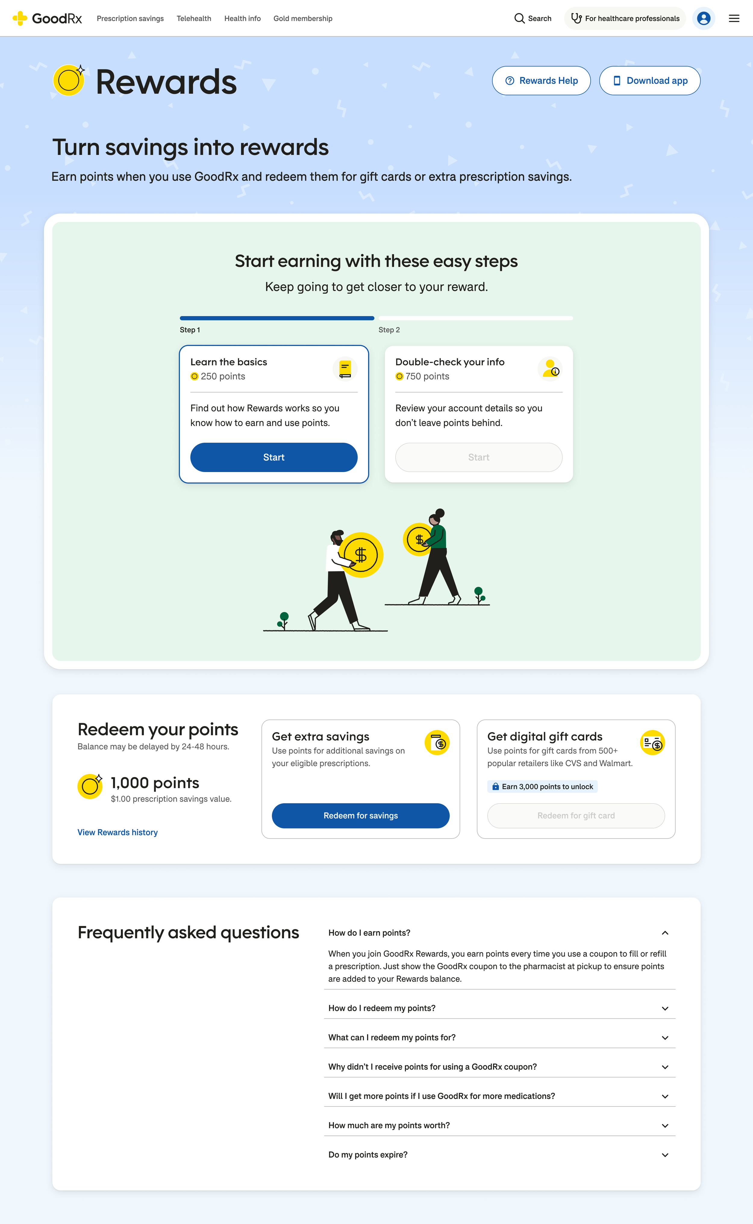
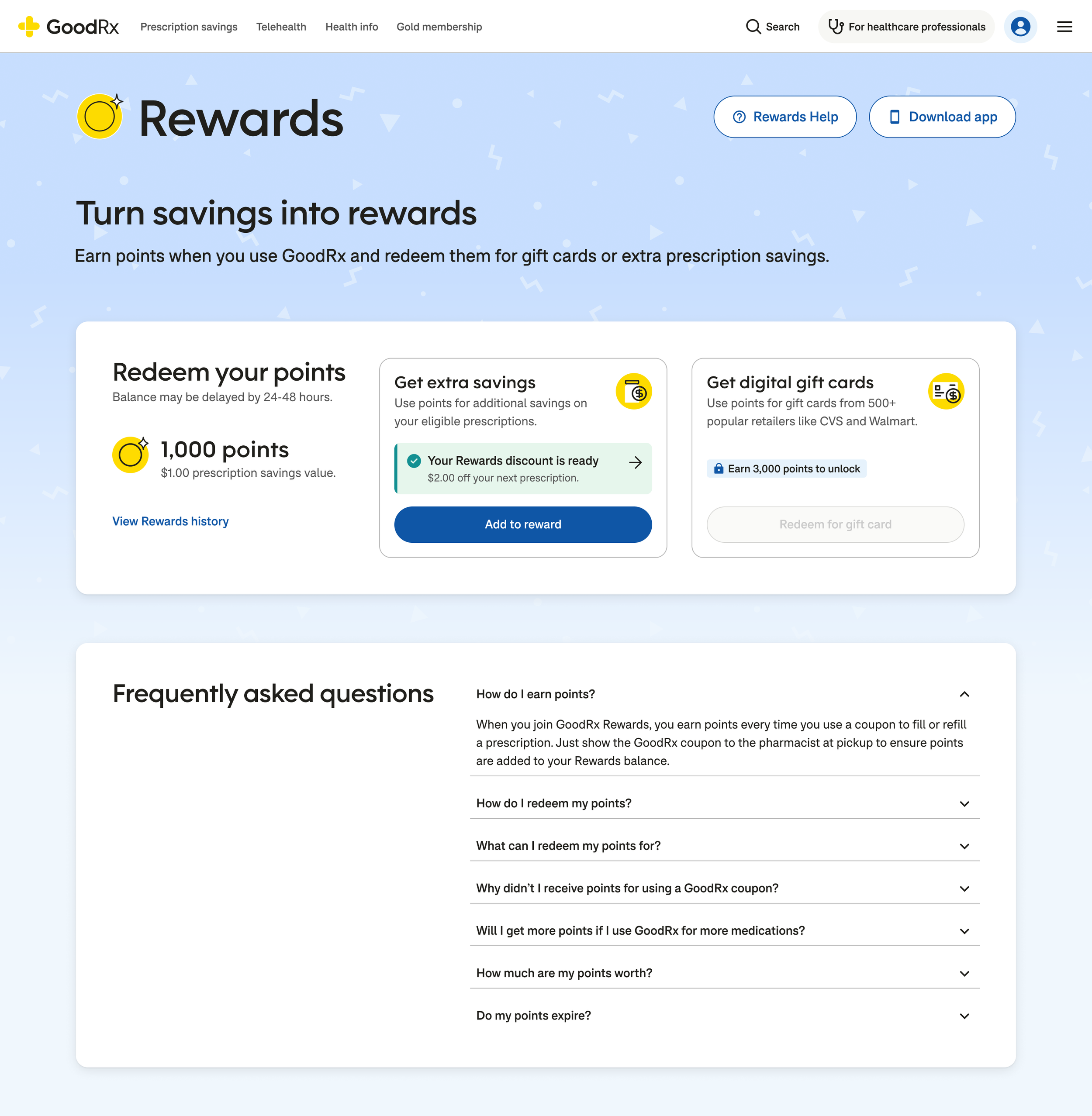
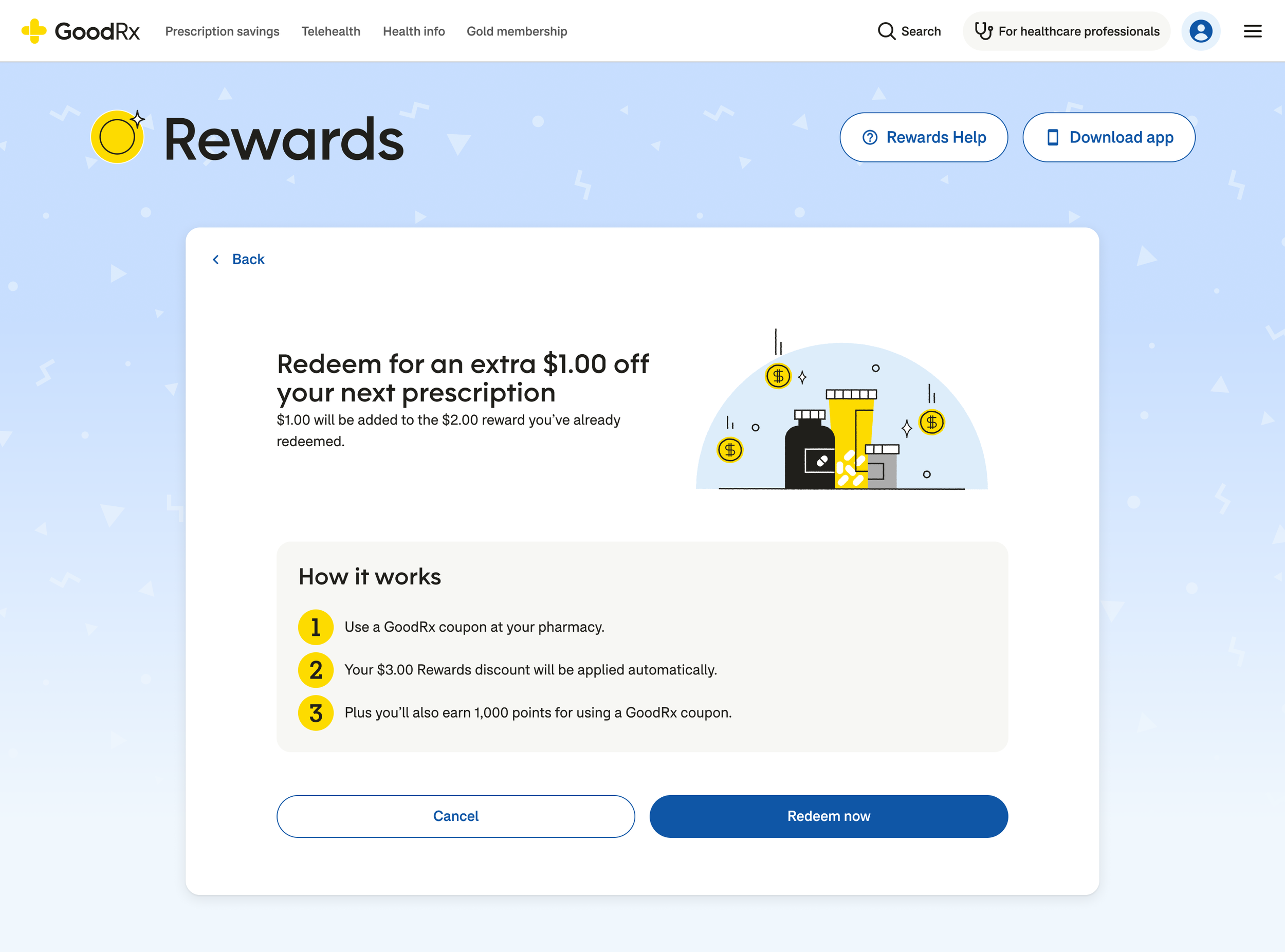
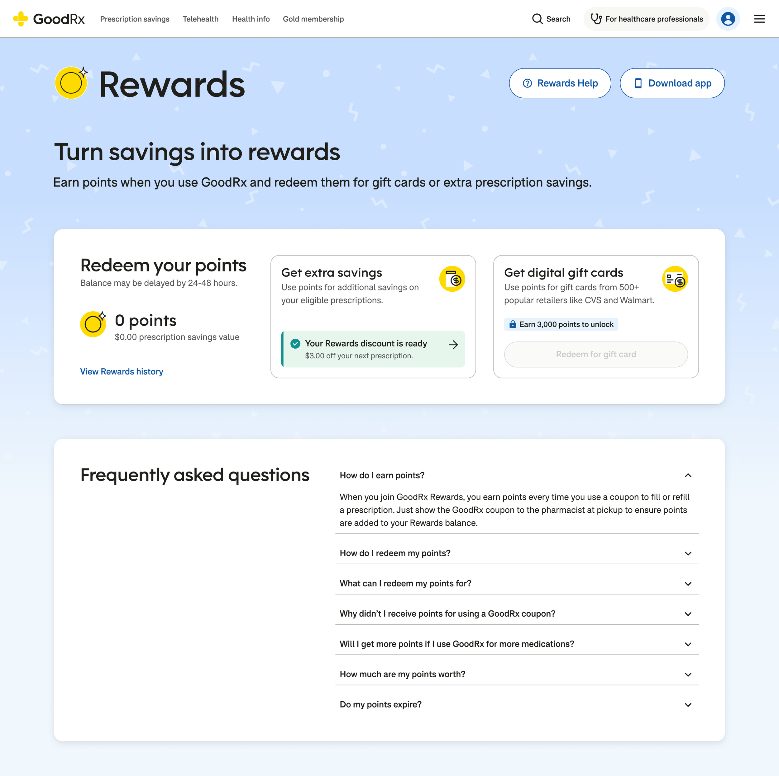
Example user experience for a Free member redeeming points for a discount.
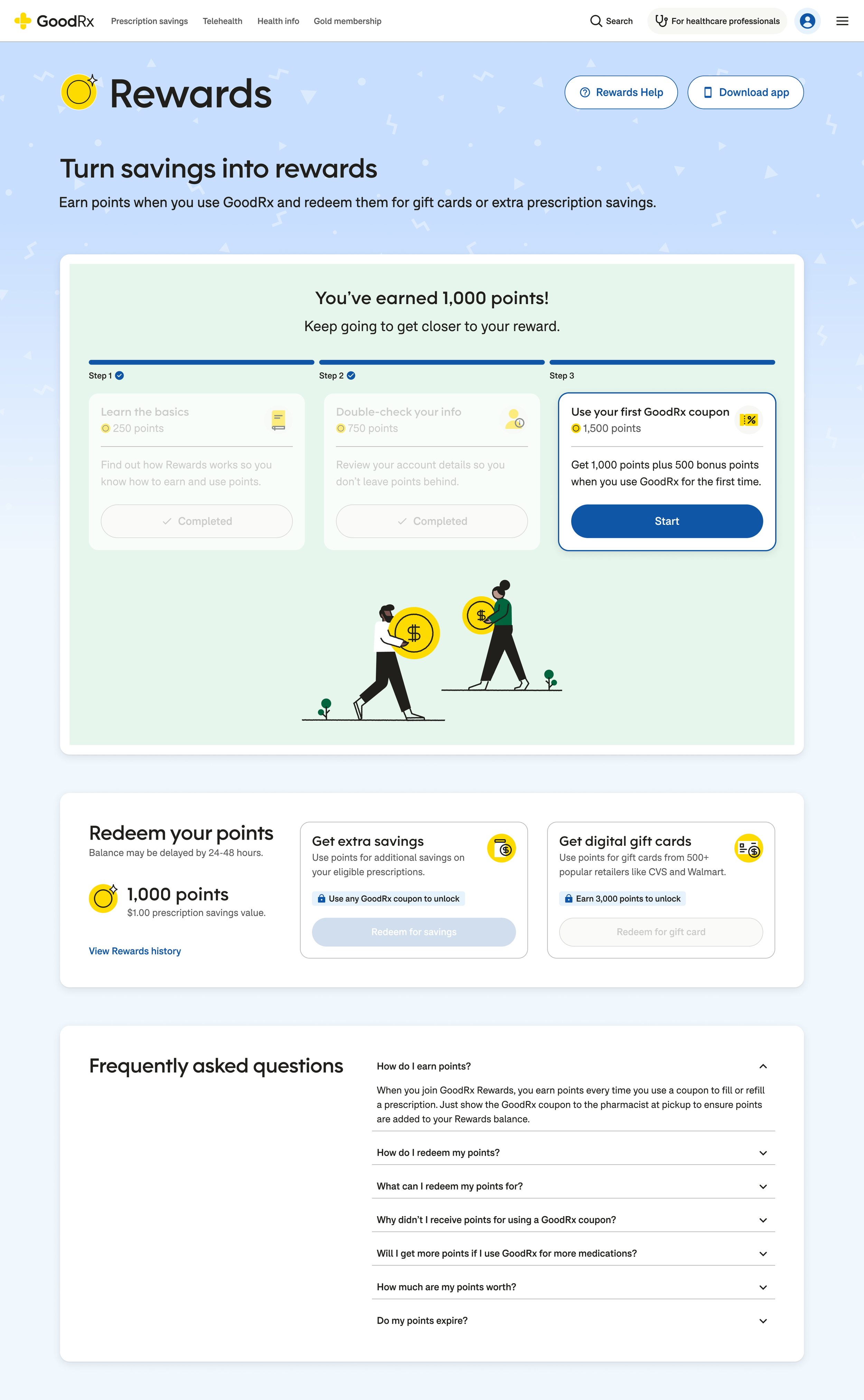
Sometimes redemption wasn’t the best action.
For members who hadn’t used a coupon, earned points, or completed activation, I kept the existing activation module prominent and designed the surrounding experience around what they could do next, rather than leading them into an empty or unavailable redemption state.
Making rewards cumulative.
Redemption wasn't always the end of the journey. Members with an active prescription discount could continue earning points and add more rewards to their savings.
I designed this flow to recognize the value they'd already earned while making the next redemption clear, allowing rewards to behave like an accumulating benefit rather than a series of disconnected transactions.
Outcome
Good incentives don't have to remove choices. They can make the better choice easier to select.
The project brought rewards redemption to the web through a flexible framework that accommodated eligibility, activation, prescription savings, gift cards, and membership states.
By separating prescription savings redemption from gift card redemption and giving it greater visual prominence, I could support the business goal of encouraging savings while preserving members' ability to choose how they used their rewards.
More of my work
-
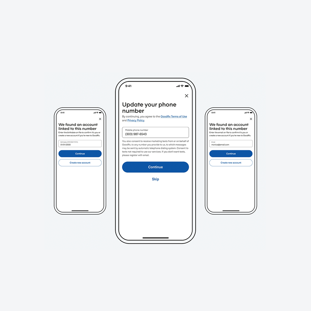
![GoodRx app login flow for a recycled phone number, showing account matching via birthdate and SMS verification.]()
Recycled Mobile Number Verification
GoodRx | Senior Product Designer
-
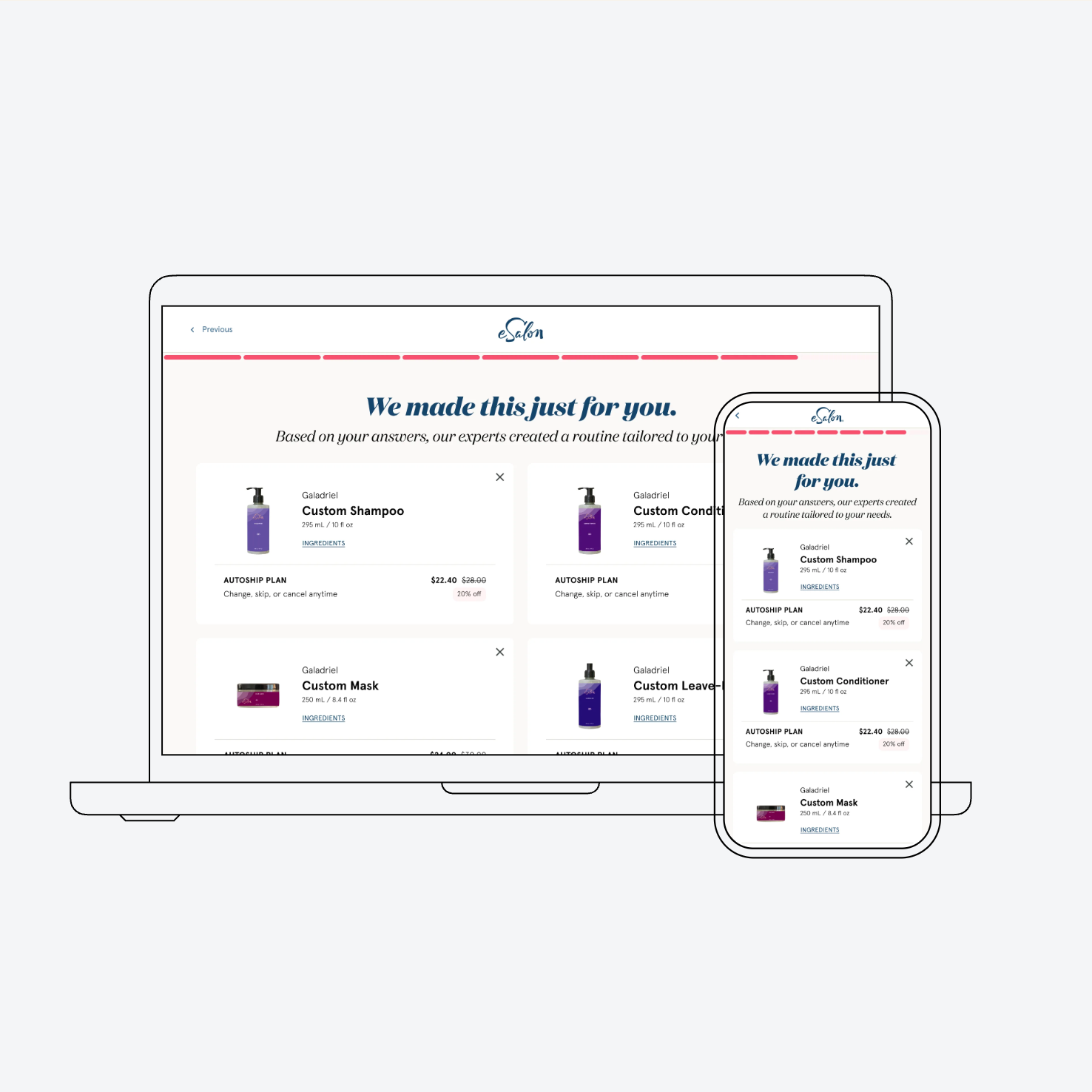
![Personalized eSalon haircare routine generated from a customer’s quiz responses, shown across desktop and mobile.]()
Personalized Hair Care Quiz
eSalon | Lead UX Designer
-
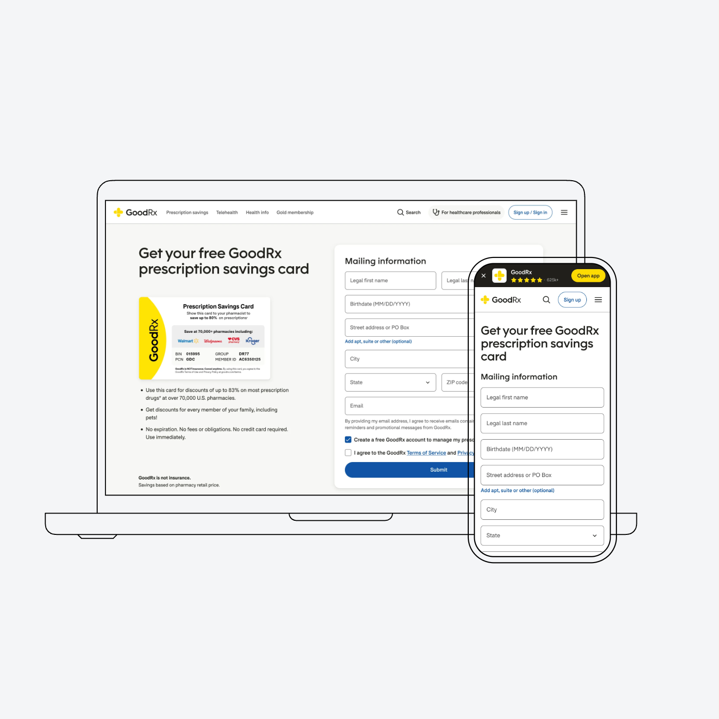
![GoodRx prescription savings card enrollment experience, helping members request a card and provide mailing information across desktop and mobile.]()
Prescription Savings Card
GoodRx | Senior Product Designer
-
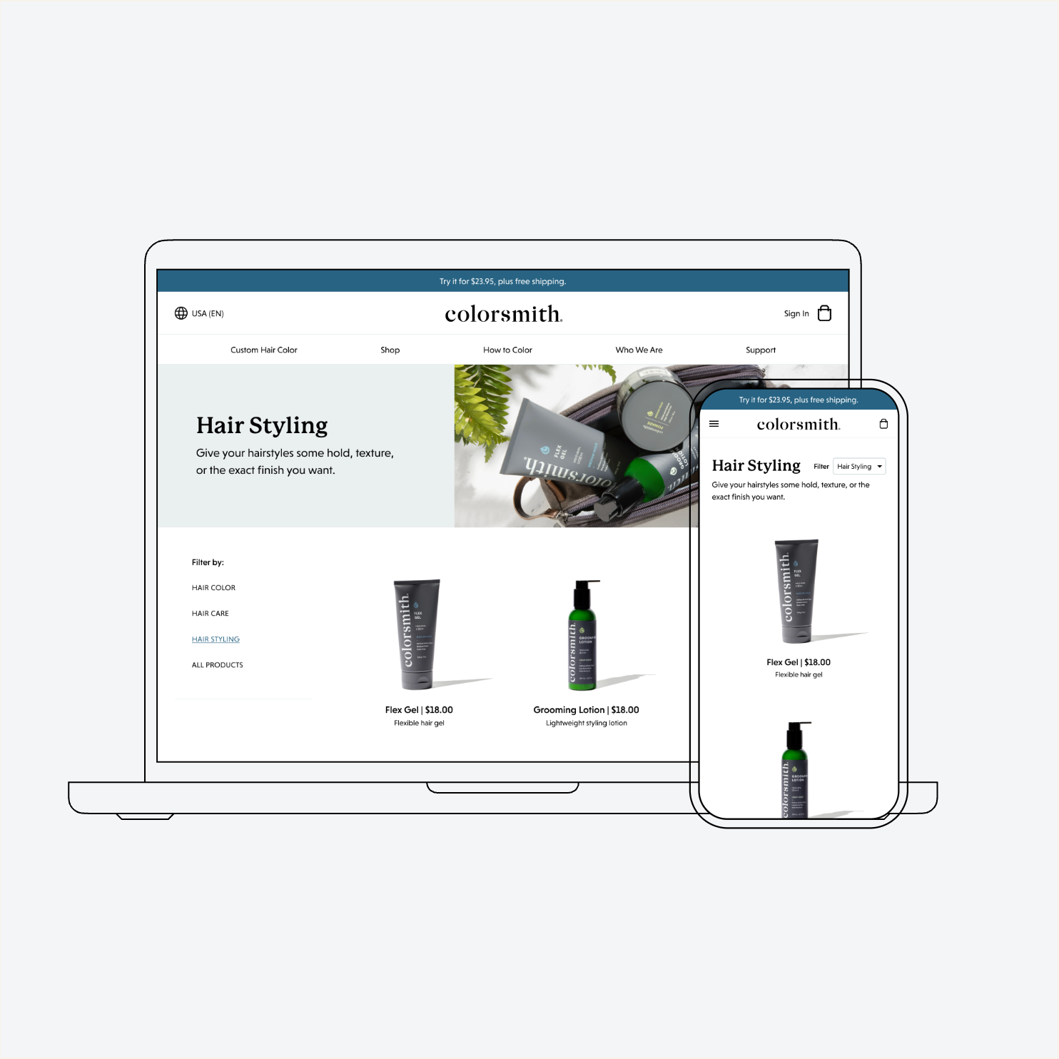
![Colorsmith hair styling product catalog, helping customers browse and filter products across desktop and mobile.]()
Navigation & Product Discovery
eSalon (Colorsmith) | Lead UX Designer